 Matthew Wang
Taipei Film Fund
UI/UX · May – Aug 2021 · Live ↗

What it is
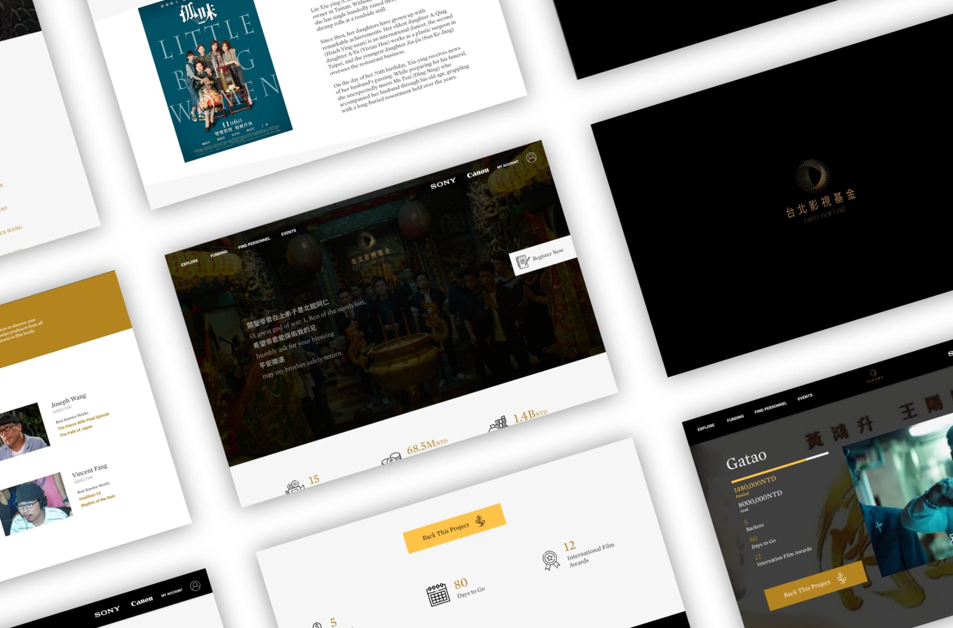
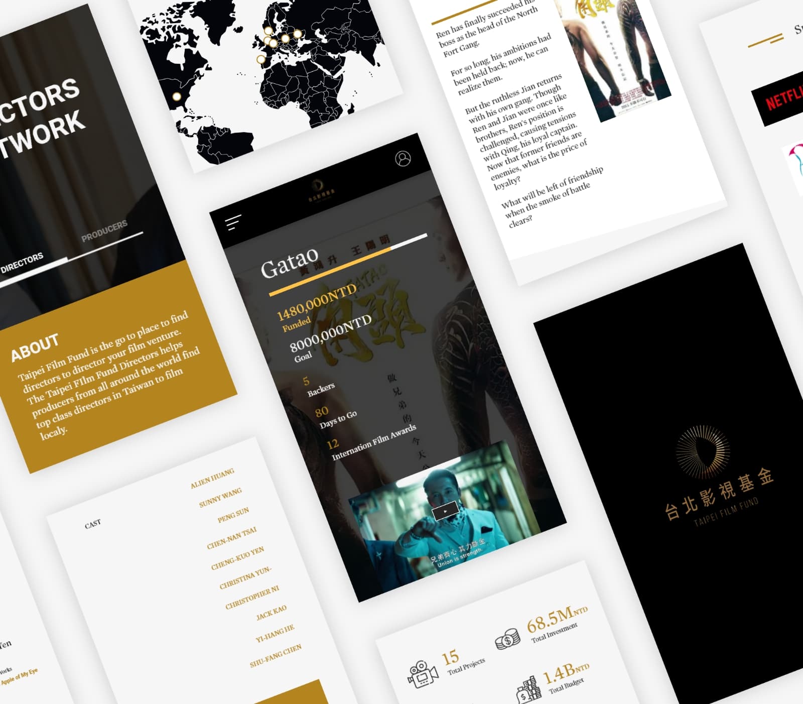
Concept site for a fund where investors, producers and directors find information on funding, co-production and international promotion. Design-only project.
Process
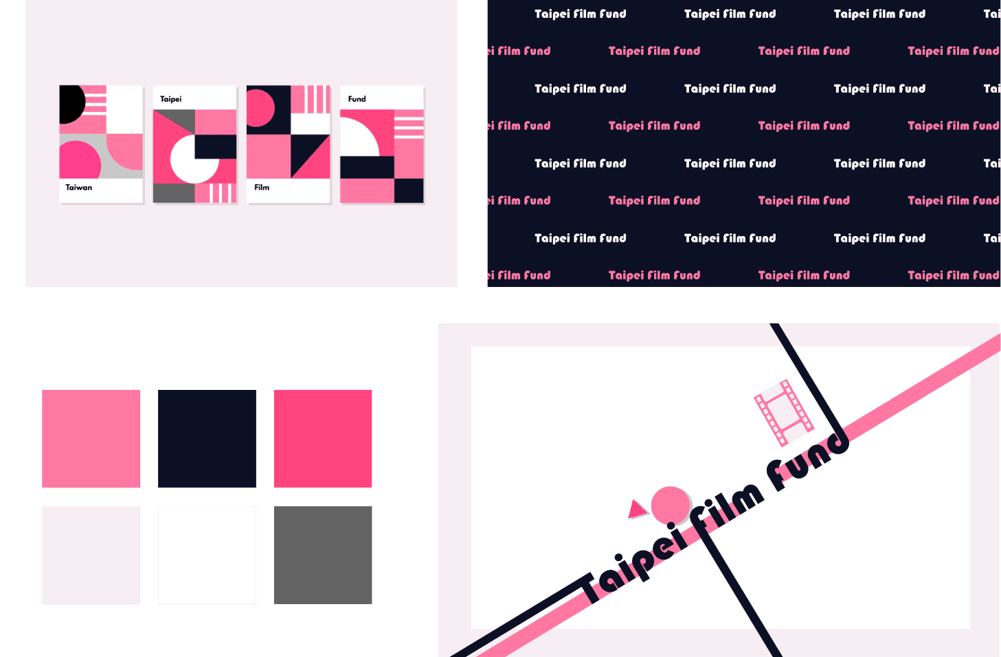
Iterative mood boards drawn from film marketing. The early pink direction was dropped for gold on black, which reads as luxury and matched the fund's existing brand. Modular sections so each film project can have its own look.
Gold on black

Gold for luxury and quality, black for the screen. Sharp type, lots of space, and modular blocks so each film project can carry its own imagery without breaking the grid.